Album - Rarities
Artist - The Smiths
Date - January 19th, 2022
Rarities was the first album I ever assembled, and, consequently, the first cover I ever created. Could you tell?
During this time period, I was absolutely & wholeheartedly obsessed with The Smiths. For months on end, they were very nearly the only band I listened to, save for a few odd occasions here and there. I discovered the band in July of 2021, and fell deeply in love with them almost instantaneously. Their music was wholly different to anything I had ever heard before. Morrissey's sardonic, witty, and oftentimes depressing lyrics dispensed genuine bliss into my ears, supplemented by Marr's incredibly creative guitar riffs and Rourke's infectious basslines, right along with Joyce's straight-to-the-point drumming. Almost every hour of every single day during that time was spent alongside The Smiths' music. Naturally, I had completely exhausted the extent of the band's catalog over a span of several months. Yet, I craved more. I combed through the Internet in search of any more Smiths content I could get my hands on. Soon after, I stumbled upon the Morrissey Solo Forum, a place in which fans of both The Smiths & Morrissey gathered to discuss ... absolute drivel for the most part. In complete honesty, the forum is undoubtedly one of, if not the most toxic & dull communities on the whole of the Internet. Nevertheless, despite my apprehension regarding the forum, I eventually found a trove of archives stored on the forum's endless pages—archives filled with rare tracks, demos, live performances, and all manner of interesting artifacts related to both artists. After delving into these folders, I selected some of the tracks which I was especially curious about and downloaded them. These tracks—all 14 of them—formed the basis for Rarities.
The Smiths had a very particular choice in cover stars. Typical Smiths covers featured icons (celebrities, actors, actresses, etc.) from the 50s, 60s, and 70s, practically all of which served as some form of inspiration to Morrissey. Morrissey was the sort of "chief-executive" regarding the art direction of The Smiths, of course being aided by the wonderful Jo Slee (whose involvement in the creation of The Smiths' general aesthetic direction cannot be understated) for the duration of the band's lifetime. As such, I felt it morally just to pay homage to one of his favorite actors—and, perhaps, even people—of all time. After very brief deliberation, I selected James Dean to be the star of the cover. Truly, who better than Morrissey's most esteemed idol (arguably) to grace the cover of this album? The selected image was a photograph of Dean behind the scenes of his 1955 film Rebel Without a Cause.
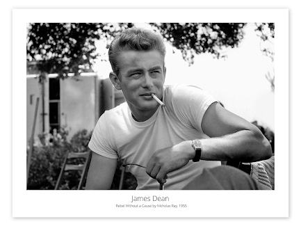 |
| James Dean behind the scenes of Rebel Without a Cause (1955) |
Apparently, whichever image I selected on the Internet had the contrast bumped up heavily, which actually primed it to make a decently captivating cover. While the mostly black-and-white art is a far cry from the colorful duotone images which adorn many Smiths covers, I still believe it mostly captures the essence of their artistry. The increased contrast actually goes a long way in making the cover look a bit more dynamic than the drab & dull & basic black-and-white of the original photograph.
If my memory serves me correctly, applying the text to the cover image was the most challenging part. At this point in time, I was wonderfully clueless on how to successfully work any sort of image manipulation software. I was far too poor to afford Photoshop & the like, so I had to resort to free online image editing software like some sort of neanderthal. Apparently, I was a neanderthal back in those days (how much has changed?) because the software I utilized confused me half to death. For some odd reason, I could not wrap my head upon the concept of placing text on an image. So, rather than figure it out, I downloaded a PNG file of "THE SMITHS" logo and slapped it on the cover (like a neanderthal). I actually had to remove a portion of the tree branch that extended down in order to make way for the logo. It was a plainly crude way of doing things—really all I did was draw white blotches over the section of branch—but nevertheless, it worked flawlessly. Awfully strange how I was able to figure that out but not text ...
 |
| My first prototype for the cover. You can see the text was larger before I decided to downsize it and remove the little portions of tree branch that extended downwards |
Evidently though, I eventually did learn to place text on an image, as the "RARITIES" text in the image is certainly not from a PNG, as you can see by the very distinct darker text color as well as the completely different font. Oh well. After finishing up, I thought it looked very posh, but the passing of time has not been kind to my opinions on this cover. Still, I think it was a respectably decent first effort, like a baby diving headfirst into the ocean and only just making it out alive & undrowned.
If I were to do it over again, I would make sure to actually match the fonts of the two pieces of text, along with their colors. I may have also made the text smaller, but who knows. I truly have no desire to remake this cover because—to me—it's iconic, even despite the very obvious flaws. I have a certain fondness for it only because it was my very first. When making this cover, I don't believe I had anticipated that creating covers would become a multi-year spanning affair. Really, I have this cover and its associated album to thank for the endless enjoyment (and frustration) of this strange hobby of mine. Irregardless of the little quirks and mistakes in the cover of Rarities, I still look at it fondly, although with a bit of cynicism. Rarities is like a child who continues to disappoint and disappoint, yet you cannot help but love them because they are still your child. In a roundabout sort of way, the Rarities cover is my child, however on the nose that may sound.
- E. Riff
P.S. I still have a bit more to say about this cover. Expect (or fear) a follow up post.

Comments
Post a Comment